We rebuilt how invitations get made on Page2Party. This is the product experience, what was broken about the old one, and why we changed it.
Free forever. No signup to start.
Same goal — a finished invitation. A completely different path to get there.
Before
Now
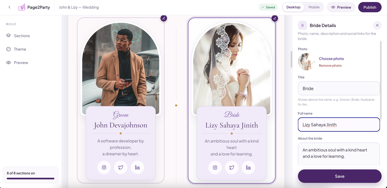
No more filling out a form and hoping it looks right. Every change appears on your invitation as you make it.
A real screenshot of the live builder — editing the couple's details on the left, the invitation updating instantly on the right.
Every change below traces back to something we saw in user feedback or in how people actually used the old builder.
The problem
People filled out a long form before seeing anything that looked like their invitation — and dropped off before reaching the end.
Live builder instead of a big form
The new builder shows a live invitation from the first field you fill in, so you always know what you're building toward.
The problem
Most people start their invitation on their phone, but the old flow was clearly designed for desktop first and squeezed onto mobile.
Mobile-first design
We redesigned the builder mobile-first, then scaled it up to desktop — so the primary way people actually use it is the best-designed one.
The problem
Requiring an account before someone could even see what the product does was a wall a lot of visitors never got past.
No signup required to start
Now anyone can start creating immediately. Signing in only happens at the moment it actually matters — publishing.
The problem
A pricing page and paywall in front of templates made people question the product before they'd even tried it.
Completely free, forever
We removed the paywall entirely. Every template and the full builder are free, with no upgrade prompt blocking the way.
The problem
Editing meant leaving the invitation, searching a dashboard for the right settings page, and losing your place.
Direct, in-context editing
Every section is now editable directly from the builder, right where you're already looking at it.
The problem
The same detail — like a venue name — often had to be typed into multiple places, and it was easy for them to drift out of sync.
Structured, reusable content
Content is now structured once and reused automatically across every section of the invitation that needs it.
The problem
Old invitation links used random-looking slugs that made guests hesitate to click, unsure if the link was legitimate.
Readable, custom URLs
Invitations now get a clean, readable default link, plus the option to set a custom one — links people recognize and trust.
The problem
Unpublished previews and published invitations looked identical, so people occasionally shared a link that wasn't ready yet.
Clear preview vs. published states
Preview and published states now look clearly different, so it's obvious which link is safe to send to guests.
None of this was a redesign for its own sake. Every change came from watching where people actually got stuck, reading what they told us directly, and asking why the old flow made a simple thing feel harder than it needed to be.
We're releasing it as one connected update rather than a scattered set of tweaks, because the whole point was to make the journey — start to finish — feel obvious. We'll keep listening and keep shipping.
Start creating in seconds. No account, no form, no cost.
No credit card · No design skills needed · Free forever